Affichage des articles dont le libellé est vert. Afficher tous les articles

vendredi 12 septembre 2014

Lotta Agaton for Herman Miller

Swedish super stylist Lotta Agaton (also my former teacher at the styling class I took at Beckmans Akademi last year) was in the US earlier this year together with a big team to shoot pictures for iconic furniture manufacturer Herman Miller. Uncluttered, sober and inspiring as always when Lotta Agaton has worked her magic. Photo by Petra Bindel.

La super styliste suédoise Lotta Agaton (aussi ma formatrice au stage de stylisme que j'ai suivi l'année dernière à Beckmans Akademi) était aux Etats-Unis plus tôt cette année pour réaliser des photos pour Herman Miller, fabricant de mobilier iconique. Epuré, sobre et inspirant, comme toujours quand Lotta sort sa baguette magique. Photo par Petra Bindel.

lundi 1 septembre 2014

Hello September!

Hello Monday and hello September! Autumn is off to a flying start for me with new projects and also Maison&Objet opening at the end of the week. Busy times but also some fun moments ahead :)

In other news, the English text on this blog will from now on come before the French version. The goal is simply to adapt to my readership, which is 1/3 French speaking and 2/3 international readers.

Bonjour lundi et bonjour septembre! La rentrée commence sur les chapeaux de roues pour moi avec des nouveaux projets et le salon Maison&Objet qui ouvre ses portes en fin de semaine. Un agenda bien rempli donc mais aussi des chouettes moments en perspective :)

D'ailleurs, vous pouvez constater que le texte français sur ce blog viendra désormais après la version anglaise. Le but est simplement de m'adapter à mon lectorat qui est composé d'environ 1/3 francophones et 2/3 lecteurs internationaux.

Photo Hagedornhagen

Having a crush on these leaf prints from Hagedornhagen that I recently ordered for the webshop! Soon online here.

Gros coup de coeur pour ces affiches feuilles de Hagedornhagen que j'ai récemment commandé pour le shop! En ligne sous peu ici.

vendredi 29 août 2014

White with contrasts

En tombant à l'instant sur cet appartement très blanc et aéré sur Stadshem, j'ai été séduite par la façon dont on a ajouté des détails plus foncés en vert olive, brun et cuivre pour contraster avec le fond blanc immaculé. J'aime beaucoup aussi toutes ces plantes vertes qui rendent plus vivant un intérieur tout blanc comme celui-ci.
Bon weekend à tous!

I just ran into this very light and airy flat for sale on Stadshem, and fell for how they have mixed in darker details in olive green, brown and copper to contrast with the pure white background. Love all the green plants too, they definitely add life to an all white interior like this.
Happy weekend to you all!

Source Stadshem

jeudi 21 août 2014

New dusty shades from Jotun Lady

Cette semaine, le fabricant de peintures norvégien Jotun a lancé une nouvelle collection de peintures dans cette palette de couleurs grisées que l'on verra beaucoup cet automne à mon avis. La collection Lady Balance se décline en 3 thèmes: Balance - nuances de vert, Beauty - chair/rose/rouge et Simplicity - noir/blanc/gris/jaune.
Très joli stylisme par les talentueux Kråkvik & D'Orazio.

This week, Norwegian paint manufacturer Jotun launched a new collection of paints in this dusty colour scheme that I believe we will see a lot of this autumn. The Lady Balance collection comes in 3 themes: Balance - shades of green, Beauty - nude/pink/red and Simplicity - black/white/grey/yellow.
Beautiful styling by the talented Kråkvik & D'Orazio.


Ma préférée est la nuance de vert-gris ci-dessus, et je prendrai aussi la table, les chaises et le tapis, merci!

My favourite is the green-grey shade here above, and I'll also take the table, the chairs and the rug, thanks!

mardi 20 mai 2014

Contrasts

Je trouve que les contrastes rendent une maison plus vivante et moins prévisible, que ca soit un mélange de styles, de couleurs ou de matériaux. Cet appartement n'est peut-être pas très personnel (il a été aménagé pour être vendu après tout), mais il joue beaucoup sur les contrastes: une palette un peu maussade de brun-vert-bleu sur un fond d'un blanc immaculé, la chaleur de la laine contre le froid du métal, le noir contre le blanc etc.

I think contrasts make a home more living and less predictible, whether you are mixing styles, colours or materials. This flat might not be so personal (it's staged to be sold after all), but it's playing a lot with contrasts: a little sullen palette of brown-green-blue on a crisp white backdrop, warm wool against cold metal, black against white etc.

mardi 4 février 2014

Wohnidee - Petra Bindels home + my styling

Aujourd'hui je pars à Stockholm pour retrouver mes amis bloggeurs, visiter le Furniture & Light fair, et participer à quelques événements organisés dans le cadre de la Design Week. Emma et Allan nous ont aussi concocté un programme fabuleux pour notre blog tour et j'ai hâte de vous en dire plus!
Comme d'habitude, vous pouvez me suivre sur instagram (anna_g) ou si vous n'êtes pas sur instagram vous-même, vous pouvez voir toutes mes photos ici.

Today I'm off to Stockholm to meet my blogger friends again, visit the Furniture & Light fair, and participate in some of the great events that are organized during the Design Week. I'm also very excited about the program Emma and Allan have organized for our blog tour and can't wait to tell you more about that!
As usual, you'll find me on instagram (anna_g) or if you're not on instagram yourself, you can see all my photos here.


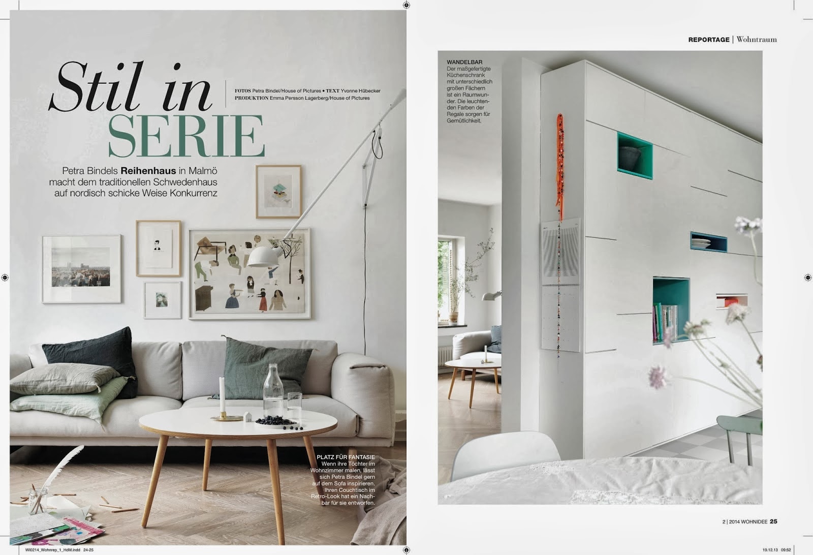
Voici l'appartement de la photographe Petra Bindel, vu dans le dernier numéro du magazine allemand Wohnide. Stylisme par Emma Persson Lagerberg.
J'adore ses bibliothèques et rangements intégrés, aussi bien les blanches avec ses ouvertures en vert, comme celles en contreplaqué. Parfait pour optimiser l'espace, ranger le bazar et exposer les belles choses.

This is the flat of Swedish photographer Petra Bindel, seen in the latest issue of German magazine Wohnide. Styling by Emma Persson Lagerberg.
I love her built in bookcases and storage solutions, both the white one with green openings, as well as the one in plywood. Perfect for optimizing space, hide away the clutter and display the nice stuff.

Photo Petra Bindel / styling Emma Persson Lagerberg

Et en parlant de Wohnidee... dans le numéro de Janvier on a pu voir mes photos sur trois pages entières dans un article sur la création de natures mortes. Très fière :)

And talking about Wohnidee... in the January issue you could see my photos on three full pages in an article about creating still lifes. Very proud :)

mercredi 29 janvier 2014

Formex part 2

Dans la catégorie mieux vaut tard que jamais, voici la 2ème partie de mon résumé de Formex! Vous pouvez voir la 1ère partie ici.
Globalement, la nature avait envahi le salon, avec de la verdure partout. J'ai vu du verre coloré à l'ancienne en vert et ambre, beaucoup de céramiques et aussi du marbre et d'autres pierres. Un peu moins de cuivre qu'au dernier salon, mais pas mal de laiton. Les motifs graphiques sont toujours là, mais également des motifs plus ethniques ou florales. J'ai vu plus de couleurs qu'au dernier salon, peut-être signe d'un certain optimisme général? A part le vert, il y avait aussi du bleu, du jaune et du corail, et toujours pas mal de pastels. 

In the category better late than never, here comes the 2nd part of my summary from Formex! You can see the 1st part here.
Globally, nature seemed to have invaded the fair, with lots of greenery everywhere. I saw vintage colored glass in green and amber, lots of ceramics as well as marble and other stones. A bit less copper than at the last fair, but quite a lot of brass. The graphic patterns are still there, but also more ethnic and floral ones. I saw more colour than the last time, maybe a sign of a certain general optimisme? Besides the greens, there was also blue, yellow and coral, and still quite a lot of pastels.


En haut / Top: Linum / Mateus
En bas / Bottom: Sagaform / Kähler


Jolies nouveautés House Doctor. Vous pourrez retrouver plusieurs de ces produits dans mon shop bientôt.

Lovely news from House Doctor. You'll find several of these products in my shop soon.


Céramique simple et rustique vue sur l'expo tendance. Malheureusement, je n'ai pas noté qui les fait... mais je suis sûre que l'un de mes lecteurs va pouvoir m'aider?!

Simple and rustic ceramics seen in the trend zone. Unfortunately, I didn't check who makes them... but I'm sure one of my readers will be able to help me out?!


Ylva Skarp avait un joli stand comme d'habitude et j'ai immédiatement passé commande de ses nouveaux posters :)

Ylva Skarp had a lovely booth as usual and I immediately ordered some of her new prints for the shop :)


Beaucoup de cuivre, laiton et marbre chez le danois H. Skjalm P. J'ai bien aimé le marbre vert, ca change!

Lots of copper, brass and marble by Danish brand H.Skjalm P. I liked the green marble, nice for a change!


Tell me more était l'un des grands coups de coeur du dernier salon pour beaucoup de bloggers (moi comprise), et j'avais déjà repéré ces superbes coussins tricotés... Alors ca y est, ils feront bientôt leur apparition dans le shop en blanc, gris clair et gris foncé, avec aussi des bougies photophores graphiques en noir et blanc.

Tell me more was one of the big faves at the last fair for many bloggers (including me), and I've had my eyes on these beautiful knitted cushions since then... Now they will finally show up in the shop soon, together with some graphic candles/candleholders in black and white.


Skultuna vient de se voir décerner un Wallpaper Design Award pour ces pot de fleurs créés par Monica Förster. Disponibles en laiton mat ou brillant et bientôt en stock dans mon shop!

Skultuna just received a Wallpaper Design Award for these Flower Pots by Monica Förster. Comes in mat or shiny brass and will soon be available in my shop!


Beau résumé des couleurs tendances du moment chez Broste Copenhagen.

Nice sum up of the current colour trends at Broste Copenhagen.


L'un de mes coups de coeur du dernier salon, la collection Botan de Katarina Stark, a gagné le prix du jury de Formex Formidable. Et moi j'en ai profité pour passer une commande pour la boutique de cette jolie collection de deux vases et un arrosoir.

One of my faves from the last fair, Katarina Stark's collection Botan, won the Jury's choice of the Formex Formidable award. And I took the opportunity to order this beautiful collection of two vases and a watering can for the shop.


Les étudiants du programme Artisanat et design de l'université de Linköping étaient venus exposer leur travail, et j'ai beaucoup aimé ces armoires en bois de Ludwig Zackrisson...

The students from the Crafts and design program at Linköping university came to present their work, and I really liked these wooden cupboards by Ludwig Zackrisson...


... et la carte du monde rouillée de Elise Elwin...

... and the rusty world map by Elise Elwin...


... et aussi cette version moderne du tapis ours blanc, faite à partir de tissus de récupération par Josefin Tingvall.
... and also this modern version of the icebear rug, made out of fabric waste by Josefin Tingvall.


Dans la section Young Designers, beaucoup avait choisi de développer des motifs pour textiles et papiers peints...
In the Young Designers section, many had chosen to develop patterns for textile and wallpaper...

Edit & björnen


Sofie Form

TARV

 Studio Maria Bergström


 ... et enfin RioRio, dont le plaid présenté au dernier Formex a gagné le vote du public pour le prix Formex Formidable.
... and finally RioRio whose blanket, presented at the last fair, won the People's Choice Formex Formidable award.